

In a data-driven world, storytelling with data is more critical than ever. Numbers alone can feel cold and detached, but when paired with a strong narrative, Intra-Day Performance Data becomes far more meaningful and actionable. A compelling story built around your metrics—supported by thoughtful use of colour and visual design—helps leaders understand both trends and behaviours at a glance.
To tell a compelling story with your Aspect WFM IDP data, it’s essential to visualise Intra-Day Performance Data effectively. This means creating a clear narrative around how your forecasted data compares to actual results. Did your predictions hold up? Where did they fall short? Understanding these discrepancies is critical for shaping a data story that resonates—without overwhelming your audience with raw numbers.
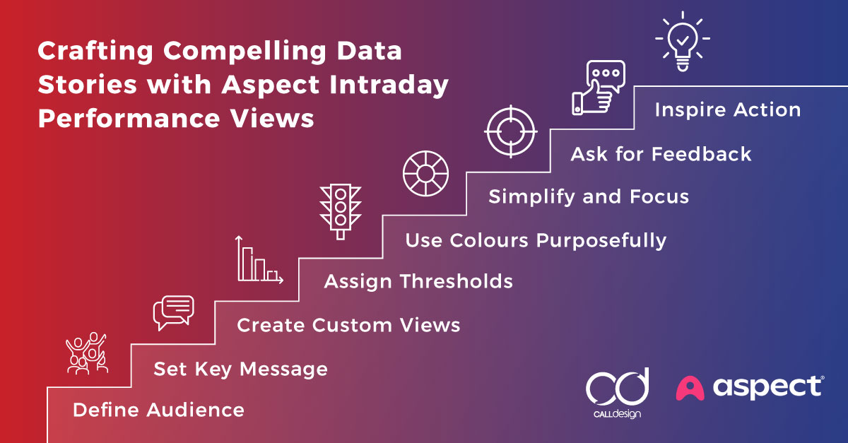
Here are some tips on how to master this art.
Start with a Clear Narrative
Telling a story through Aspect WFM Intra-Day Performance data can help your audience gain insights and make informed decisions.
Defining the story you want to tell before exploring the data and colour schemes is essential. Data should support your narrative, not overwhelm it.
Ask yourself:
- What is the key message you want to convey?
- Who is the audience, and what do they care about?
- What action or decision do you want the audience to take?
Once you have a straightforward narrative, use your data to emphasise and clarify this message. This helps avoid the trap of just showing data for data’s sake.
Tip: Create different IDP Display Sets based on your different audience types. It’s perfectly fine to create custom views based on what matters most to them!
Setting IDP Thresholds
One of the most powerful IDP Display Set features is the ability to set Thresholds that alert users when outcomes have breached certain limits. For instance, if the number of customer interactions far exceeds what was predicted, the system can provide awareness that the day will not turn out as planned, promoting the need for action.
Before configuring Thresholds, you need to define their purpose clearly.
Ask yourself:
- Are you setting a threshold to trigger an alert for abnormal outcomes or to monitor performance?
- What is a breach when data falls short (below) threshold?
- What is a breach when data exceeds (above) threshold?
- What do you consider the desired/acceptable range?
Tip: Define an acceptable data range first. This will assist with telling a story about your data when things go according to plan. Be careful when defining Thresholds; if they are too aggressive they may lead to frequent false positives (thresholds alerting the audience when there’s no real issue).
Assigning Threshold Colours
Threshold colour indicators make it easier to monitor expectations and performance and help quickly identify areas that require attention. Organisations typically only use two colour configurations, red and green. However, I recommend three colours.
Are you asking yourself how?
- IDP Data Column – assign the background window display a colour (I recommend, green. This colour represents your acceptable range for outcomes).
- Below Threshold (falls short of expectations): Assign a Threshold colour based on whether falling short is a positive or negative for your business.
- Above Threshold (exceeds expectations): Assign a colour based on whether falling short is a positive or negative for your business.
Tip: Assign Threshold colours based on the specific IDP data measure and the story that data should tell. Threshold colours used for Volume and Average Handle Time variances typically differ from Under/Over Staff data.
Use Colours Purposefully
Colour plays a massive role in how people perceive and interpret data. Colours can guide your audience’s attention and highlight important points when used thoughtfully.
Here’s how to harness the power of colour:
- Use a colour that highlights essential data points. This will direct the viewer’s eye to the most critical parts of your story.
- Maintain consistency—Use a consistent colour scheme throughout your IDP Display Sets. If green represents within the desired/acceptable range, don’t switch to blue for the same data in another view. This can confuse your audience.
- Leverage colour psychology – Different colours evoke different emotions. For example, red might indicate alarming or urgent, while blue often conveys calm or trust. Align your colour choices with the mood or message of your data.
Final plug to gain your buy-in!
You can turn raw data into compelling stories that inspire action by starting with a straightforward narrative, choosing the right visualisations, simplifying your views, using colours purposefully, and guiding your audience through a logical flow. You’ll learn to produce data, engage and influence your audience, and make your data stories meaningful with practice.
Tips:
- Simplify and Focus – Good data storytelling doesn’t overload the viewer. Minimalism in design helps your audience grasp the key takeaways quickly.
- Ask for Feedback – Sometimes, what seems evident to you as the creator might not be as clear to others, so getting feedback can help refine your data story for maximum impact.
Something you might not expect…
I only began developing customised Intra-Day Performance Display Sets and colour associations when I realised my audience wasn’t gaining value or insights from the Intra-Day Performance data views provided. My original views were too complex. Why? As a Forecast Analyst, I loved working with data—lots of it! However, tailoring the IDP data, colours, and views to suit my audience made all the difference and became a game-changer.
Book Your Strategy Session Now!

Amy Glover
